Page 2 of 2
Re: Left Pannel takes up too much space
PostPosted: 07 Oct 2012, 17:28
by Krom
Notice how HoN handles resolutions - there are 4 main controls (3 in corners and one center bottom) and how they are connected on bottom to make them solid.
Re: This game badly needs tooltips
PostPosted: 07 Oct 2012, 17:31
by pawel95
Yeah for example i remind, that in Settlers VI there was not a gap but a "observer cam" in highest resoultion, but this isnt possible in Remake, i think. So for me it is good, like it is now, with the KaM Logo as a spacedeleter in bigger resolutions and for ME, if someone has an old little PC, he/she must live with it

Re: This game badly needs tooltips
PostPosted: 07 Oct 2012, 21:22
by T*AnTi-V!RuZz
I dislike both "modified's" very much..

Re: This game badly needs tooltips
PostPosted: 08 Oct 2012, 06:38
by Encaitar
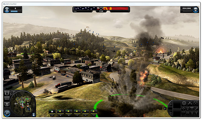
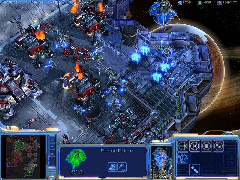
Here are some screenshots of other games to compare the interface with. The greatest different is the 'floating' panels or just 'one block'. I don't know which interface is better, the screenshots just show that both ways are used in the gaming industry. Important thing to note is that all the games do scale their UI to the fitting resolution of the player!
Anno 1404:

World of Conflict:
Battle of Middle Earth II:

Age of Empires III

Starcraft II
Re: This game badly needs tooltips
PostPosted: 08 Oct 2012, 07:13
by krs
Something in the lines of Anno's bottom right panel would look so good for this game

. And message text is so easy to read
.
Re: This game badly needs tooltips
PostPosted: 08 Oct 2012, 07:16
by krs
... Also Age of empires 3 is quite old... the screen shot is from a small resolution 1,024px × 768px
Re: This game badly needs tooltips
PostPosted: 08 Oct 2012, 07:56
by Krom
Good examples, they show how GUI moves from static rectangles to corner elements. Anno looks nice
P.S. Can someone please move last messages to appropriate topic? This is hints thread, not UI panels redesign

Re: This game badly needs tooltips
PostPosted: 08 Oct 2012, 08:40
by T*AnTi-V!RuZz
P.S. Can someone please move last messages to appropriate topic? This is hints thread, not UI panels redesign
Done.
Re: Left Pannel takes up too much space
PostPosted: 08 Oct 2012, 16:54
by Shadaoe
Anno 1404's interface is really nice and intuitive, but I don't think it'd suite the game, I like how it is now.
Re: Left Pannel takes up too much space
PostPosted: 08 Oct 2012, 17:27
by T*AnTi-V!RuZz
Anno 1404's interface is really nice and intuitive, but I don't think it'd suite the game, I like how it is now.
I agree. I really like the current and original interface. It would be wrong to change it.
Re: Left Pannel takes up too much space
PostPosted: 08 Oct 2012, 17:29
by Krom
Minor facelifting would not harm, but that job needs a true artist.
Re: Left Pannel takes up too much space
PostPosted: 08 Oct 2012, 17:59
by Lewin
We could add a checkbox to the settings "Minimalistic Interface" which removes unused space on the left panel. But if it's going to look good it really needs an artist to create new borders/backgrounds to fit it all in properly.
Re: Left Pannel takes up too much space
PostPosted: 17 Nov 2012, 08:07
by FeyBart
I'd say, if you're going to overhaul the interface completely anyway, why not make the windows modifiable? Sure, it takes a huge ton of work, but if you do it now, there is no possibility that you'd have to do it again later, when you decide you still want to make them modifiable.